
Building the integrated message, from forms to lead generation
This is a blog post I wrote for StatPro, it gives an insight into some of the work I’ve been doing for the last few months.
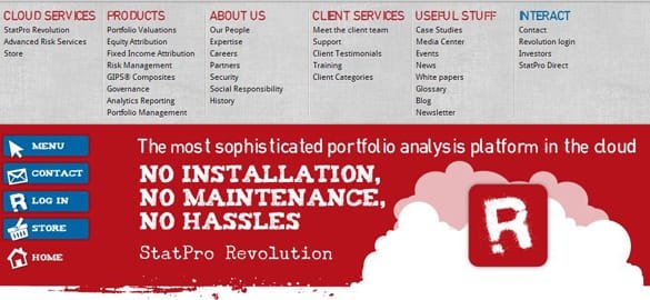
When designing the new site there were certain aspirations we wanted to achieve; it had to be easy to navigate, user friendly, and useful by proving rich and engaging content. Time (and a little bit of testing) will tell whether we have achieved these, but what is certain is that we couldn’t have done any of it without taking a look at the bigger picture and all the components that helped create it. It is no mystery that any modern B2B website these days has an array of background ‘tools’ all working together to manage the user experience online, from tracking (Google Analytics), capture forms (Marketo), sharing (AddThis) to CRM (SalesForce.com).
But how do you take those tools and use them effectively together to create an engaging and integrated journey?
I want share with you one of the ways we’ve achieved this, and the trade-off between lead generation and relevant content delivery for the visitors on our site.
We’ve been using a fantastic bit of kit called Marketo as the backbone to all of our online marketing since the start of the year. It’s a complete all-in-one solution that’s able to handle lead nurturing, lead scoring and email marketing. With the old website we used HubSpot to serve up very basic landing pages and forms, it which did the job but didn’t look great. When designing the new site, we wanted to combine the cool branding of StatPro Revolution with great functionality and user experience. The forms and landing pages had to be an extension of the site, but sit on a separate domain hosted by Marketo. Of course the user doesn’t need to know this and only cares about the content which they want to download. It is important to ensure that the ‘environment’ they visit to receive this content is not alien to the one they have just left. So how did we go about creating this ‘environment’?
We looked at the following key areas:
Styling – integrated message / striking a balance
Whilst the rest of the site has beautiful banners and a useful navigation menu, we felt that having these on the landing pages would prove too distracting for the user. At the end of the day they have arrived at the landing page having made the decision to download a piece of content so essentially we wanted to make it as easy as possible to do so.

For the landing pages we opted to include only the breadcrumbs from StatPro.com as the main form of navigation. The theory behind this was that the user could navigate horizontally but not vertically. In other words they arrived at the current landing page as a result of wanting a piece of collateral. If they made a mistake they could navigate back to the overview pages which holds all collateral.

In order to maintain a consistent brand, we opted to use the same fonts and heading styles as the main site. This helps build trust and confidence as the user is surrounded by a familiar look and feel, and we expect to see higher conversion rates as users feel comfortable in sharing their details.
With the footer, again we faced the same challenge as the menu and navigation above. If we used the one on the main site then the risk was that the user may get distracted and diverted from the main goal. So instead we opted for a simplified version of the footer which includes the key links that any B2B site should have. Of particular importance are the privacy and cookie policies.
Functionality – not just looks but brains too

With the introduction of the new EU e-privacy directive regarding cookies we wanted to make sure that we were as transparent and open as possible with our users. Not only did we include the key pages such as Privacy Policy, Cookie Policy, and Terms of Use, we also ensured that the privacy policy was prominent right at the point where the user submitted their details. (We ‘borrowed’ this idea from our friends at Marketo, I’m sure they won’t mind.) Why reinvent the wheel?
Finally, another question we had to answer was whether the landing pages opened in a new window or in the same window. The two issues we had to consider were pop-up blockers, and user navigation. During tests we found that some browsers such as Firefox and Internet Explorer 9 treated the new window as a pop-up and thus the user was unable to view the landing page without further interaction to enable the pop-up. With regards to user navigation, our main concern was that having the limited breadcrumb navigation could limit the exposure the user had to the rest of the site and its content. We have a lot of engaging collateral on the site which is designed to be useful and educational whilst at the same time generating sales leads. We opted to keep the landing pages opening in a new window, however this being online marketing, and the fact that we are now getting smarter with our tools, we are going to be running A/B tests to determine whether this is the right choice, but more on that in my next blog post.
Social Media – spreading the message

It goes without saying that social media engagement within the B2B market is on the increase. We are seeing this more and more in our industry. So for us, when building the new site, it was important to include social media sharing functionality. Marketo has its own built-in functionality to allow you to embed social media share buttons within the landing pages themselves. However they are designed to share the specific landing page you are on. For us this was limiting, mainly because the landing pages, as mentioned above, have limited content and navigation. We believe it is more valuable to share the holding page of the specific content (collateral), for example:
Holding page – http://www.statpro.com/white-paper/red-paper-making-the-case-for-a-revolution/
vs.
Landing page – http://pages.statpro.com/whitepapers-Red-Paper-StatPro-Revolution.html
Sharing the holding page is therefore much more powerful and valuable to any user who clicks on the link on Social Media. Additionally, having our own custom buttons allows us to do two things: we are able to customize the buttons to match the branding of the site, and secondly we are able to fully customize the Open Graph protocols which both Facebook and LinkedIn use. With more and more content being shared on Social Media sites, it is imperative to ensure that your content stands out. Including the right thumbnail, description and article type is key.


Creating an engaging user journey is more than having a beautiful website, it’s about ensuring that each of the components that help create that journey are in sync and integrated with each other, amongst other things. From creating a familiar environment, to ensuring that users a fully aware of their privacy, it all adds to the positive experience.
I hope this has provided you with a useful insight in to how you can use the various online marketing tools to create a user journey that in return can increase lead generation. We are not done yet however, with the ability to A/B test we hope to see whether the changes we’ve made have proved successful, and continue to try new things, why stop there.
 Previous Post
 Next Post